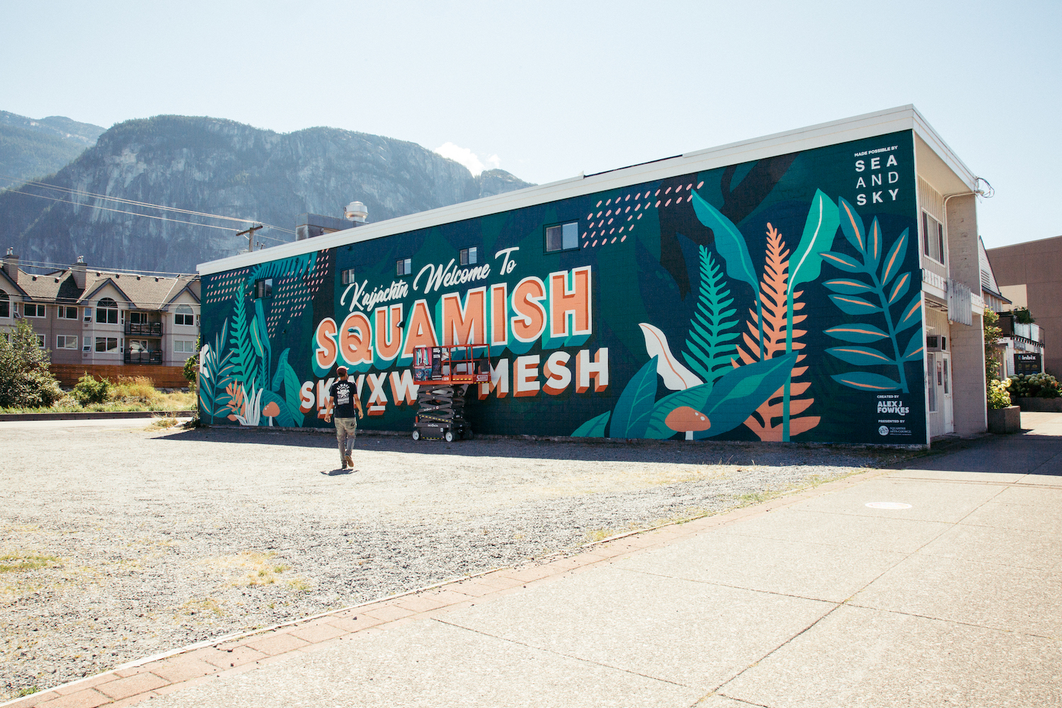
Welcome to Squamish
Photos: Silke Labson
Video: Max Bailey
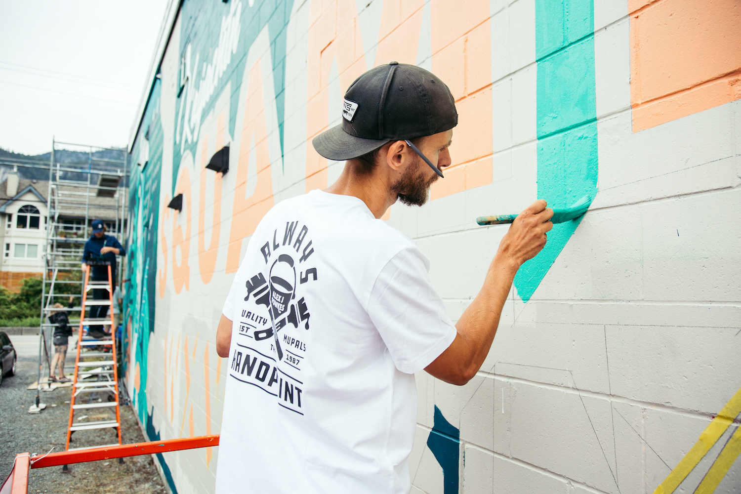
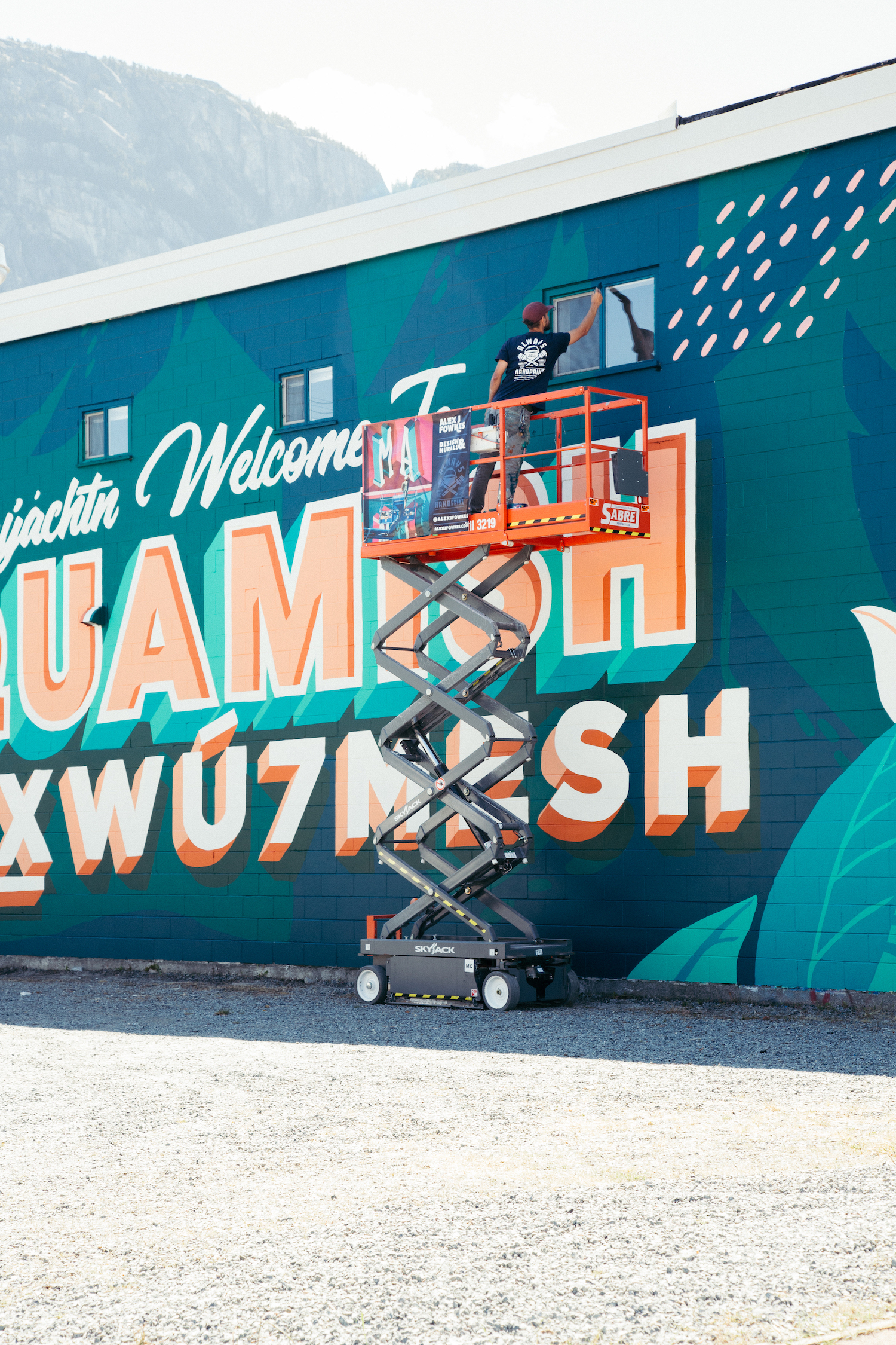
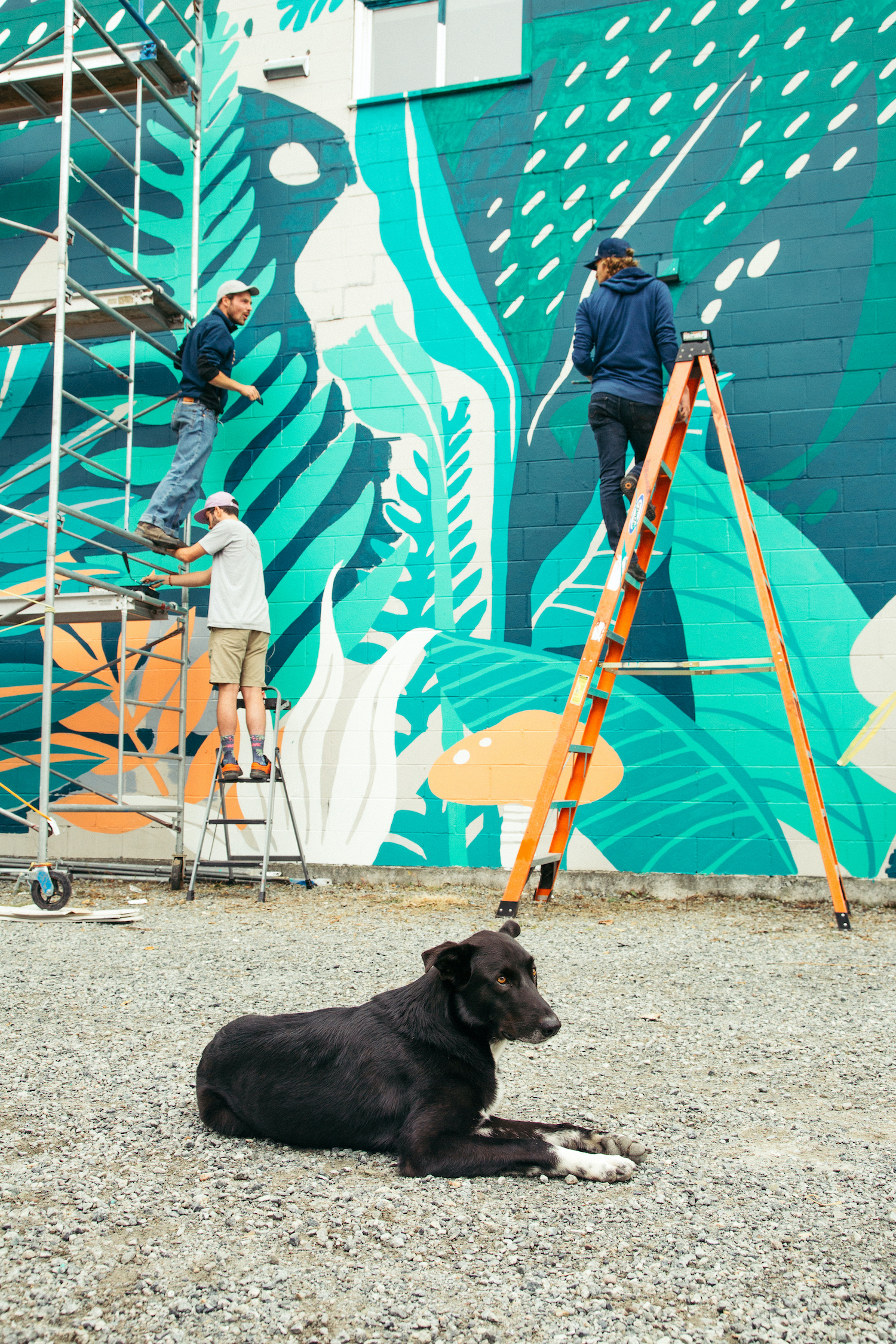
There was a lot involved with designing this, so much to consider. When I’m doing big murals, I like to consider the surroundings, where the main viewing points are, and any interesting features on the wall itself. This location has Jessa Gilbert’s mural featured on the next building which is based on more of an alpine view. I really liked the idea of making mine more of a treeline and lower influence so that as you drive by you go from treeline to alpine. I never wanted any human elements involved in this mural, purely the nature that surrounds us.
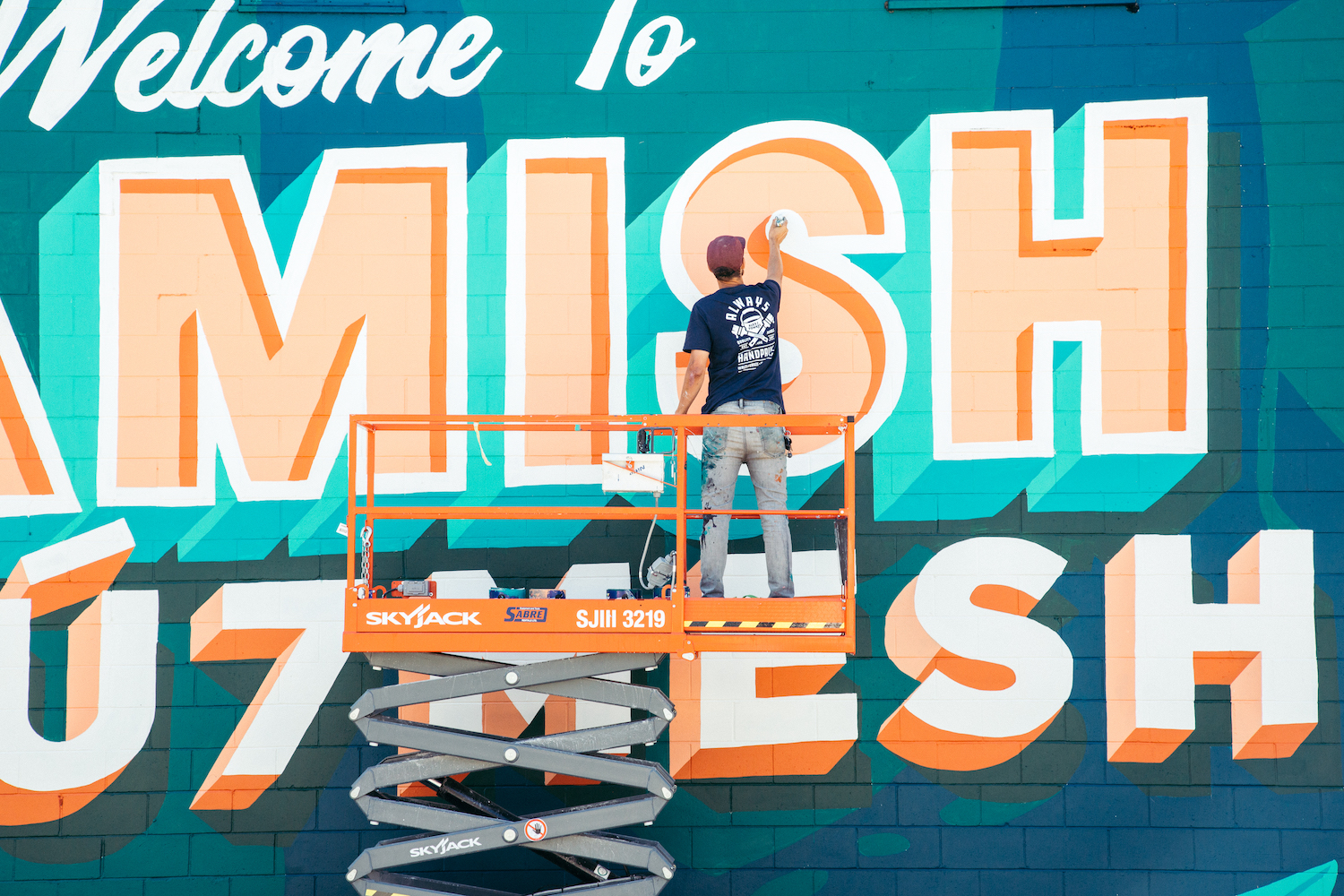
Featuring both English and Squamish language here was really important so we consulted with a Squamish Nation language expert on the translation, but also sought approval of the design. We chose to feature Ḵ’ay̓áchtn first which is “welcome” followed by “Welcome to” in English. Skwxwú7mesh is featured below Squamish to represent the foundation upon which ‘Squamish’ was built. Also, a conscious decision was to feature the peach colour of the Skwxwú7mesh lettering inside the letters of Squamish. I wanted to represent the collaboration and connection as much as possible.
